Why AI-generated posters look terrible (and how to fix them)
Stop settling for the sea of generic AI event flyers. A little direction is all it takes to escape the template trap....
Scroll through Facebook long enough and you will spot them. The uncanny valley of local event promotion. You know the ones: bloated community fayres, painfully generic beer festivals, and neighbourhood bake sales all drowning in an identical, pastel-soaked digital sludge. They blur together because they are born from the exact same lazy prompts handed to image generators. The problem isn't necessarily that the underlying models lack capability. It is that the default output has curdled into a modern aesthetic plague of slick, soulless airbrushing.
I wanted to see if we could actually break the loop. So, I ran an experiment with ChatGPT, spinning up a hypothetical spring fayre complete with samba bands and circus workshops. The first pass was predictably tragic. Despite telling the model to skip the pastel oils and people, it handed me back the exact same aggressively cheerful corporate slop I was trying to avoid. It defaults to safety. It defaults to the middle of the road. If you don't fight the machine, you end up with digital wallpaper that blends invisibly into the background noise of the internet.
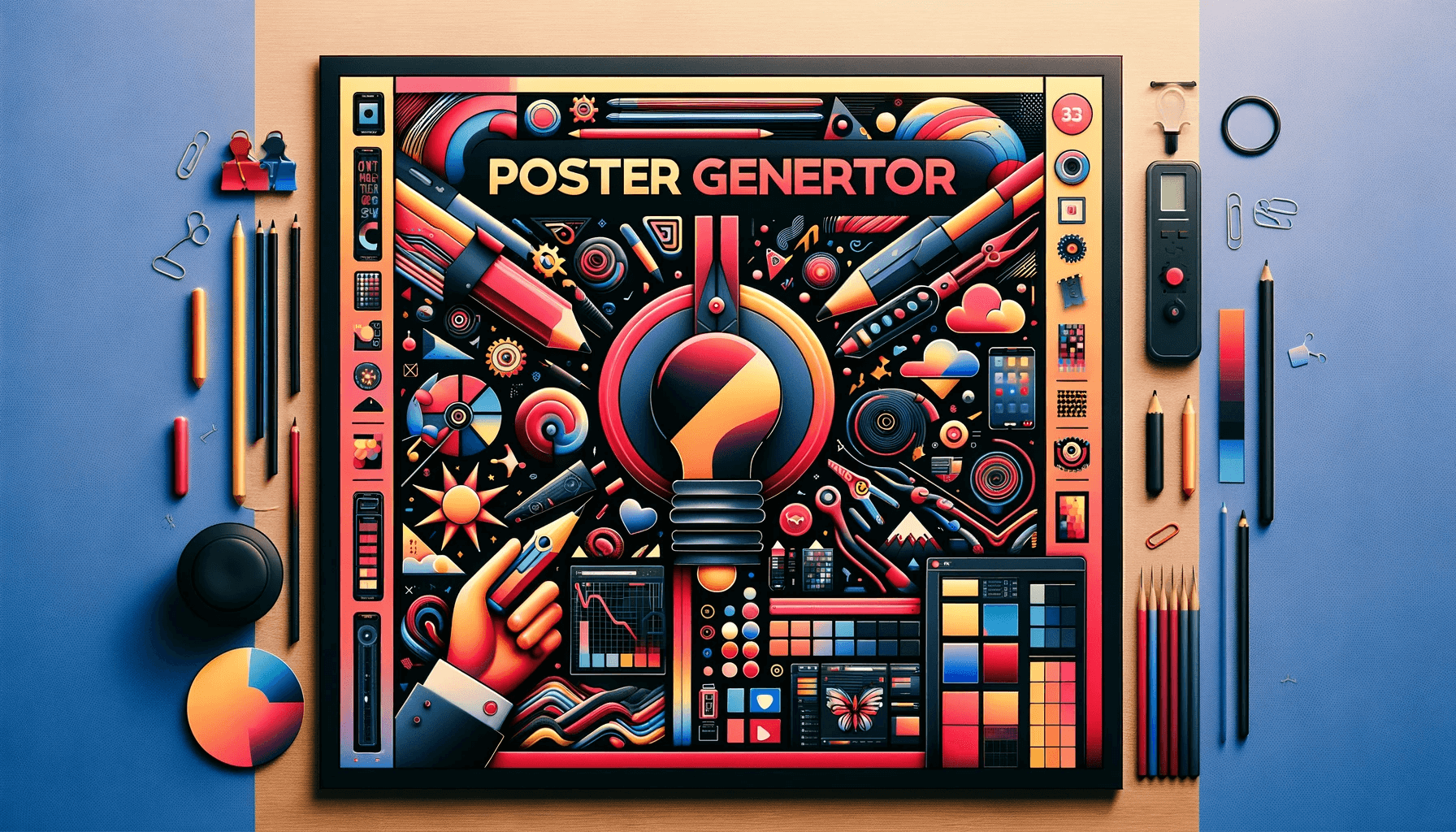
Then I pushed back. I told it to treat that first attempt as a strict boundary of what not to do, demanding a genuinely different design philosophy for the second iteration. The result completely flipped the script. Instead of bubbly watercolor florals and fake bunting, it pivoted hard into clean geometry and sharp, unyielding structure. By demanding a radical shift in perspective, the output transformed from a forgettable flyer into something that genuinely looked like it belonged on the wall of a curated design museum.

When you ask the AI for what those styles are actually called, it spits out terms like Bauhaus-influenced, Swiss Style, and geometric minimalism. That vocabulary is your weapon. Most local organisers rely on hand-drawn tropes because those are the easiest mental shortcuts for an unguided prompt. If you want your stuff to breathe, you have to name-drop the aesthetics that value function, stark contrast, and grid-based clarity over mindless decoration. Stop accepting the default grease.
Craft still matters, even when methods are doing the heavy lifting. This the tools are only as interesting as the boundaries we draw around them. If you treat generative tech like a magic button that just spits out a finished product, you deserve the generic beige hellscape it hands you. But if you treat it like an obstinate junior designer who needs firm, specific artistic direction, you might actually make something worth looking at.