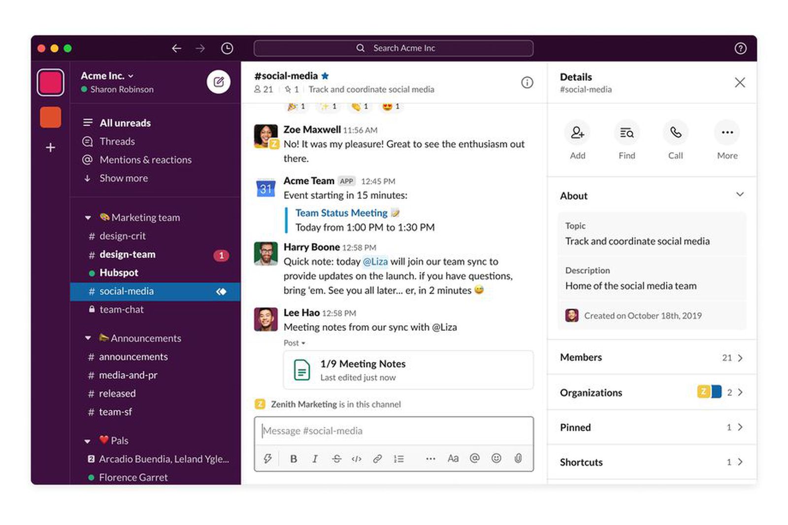
Slack is updating its iPad app with a very needed redesign. We will see it inherit a lot of features that were available in the desktop version previously. The app is getting a new two-column-based layout that will show a list of different available channels and messages on the left and all of the contents on the right. Also, the left-hand sidebar is being updated in the app and is getting better support for accessibility features like the voiceover screen reader.

These features that slack is introducing to their new redesigned app for the iPad are not revolutionary. But they’re very great additions to the app that will sometimes feel more like a giant iPhone app instead of a desktop app. Slack says that this update will serve the needs of a lot of new emerging hybrid workplaces, which will hopefully make it easier to keep up with workplace conversations while on the go.
The upgraded sidebar on these slack iPad apps sounds very useful, as the iPad has a lot of extra screen real estate. Sections are also collapsible if you want to hide groups of channels and channel names can also belong pressed to access a context menu, User names will also now include avatars in DMs, This will make it a lot easier to identify and glance. The way sections are setups should also sync with slack’s desktop version to make it a lot easier when you are aiming to keep everything neat.
:format(webp)/cdn.vox-cdn.com/uploads/chorus_image/image/70630099/1QuickAccess_02_2x.0.jpg)
The company says that this new iPad version will be available to download today, with further improvements such as Keyboard Shortcuts and additional support for accessories coming later in the year.


