Powered by

Google Phone app has picked up the latest Material You design language on Android 12


Google is slowly and steadily updating all of its apps to Be in line with the new “Material You” design guidelines. They’ve already rolled out new design elements on Google Calendar, Gmail, Google Calculator, Google Clock, Google Translate, Google Lens, Chrome, Google Contacts, and more, They’ve also added more design elements across all of their apps like the time picker UI that rolled out in Google Search and Google Keep last month, Well, if you think about it, there is a very big and substantial app that still needs a facelift.
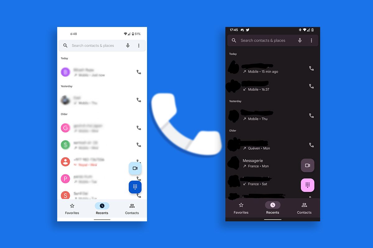
Cr: XDA Developers | Material You design on Google Phone App

Well, now version 70 of Google’s phone app includes a lot of new material. You design elements for users on Android 12. These include changes to the floating action buttons in the bottom tab. This update also brings in dynamic theming for Material You.

We should also just let you know that these design changes are not available for all of the users on Android 12 at the moment, as many of these changes have not shown up on Pixel 3 XLs, and they are not available on many different Pixel 4a’s too

All of this just points to the fact that Google is still experimenting with implementing these new design element changes in the Google Phone app. We should just wait to see the final product when the stable release comes out for Android 12 later this year, as you know, it will be a lot more polished and better to use.
Google Phone app has picked up the latest Material You design language on Android 12

Google Phone app has picked up the latest Material You design language on Android 12


Google is slowly and steadily updating all of its apps to Be in line with the new “Material You” design guidelines. They’ve already rolled out new design elements on Google Calendar, Gmail, Google Calculator, Google Clock, Google Translate, Google Lens, Chrome, Google Contacts, and more, They’ve also added more design elements across all of their apps like the time picker UI that rolled out in Google Search and Google Keep last month, Well, if you think about it, there is a very big and substantial app that still needs a facelift.

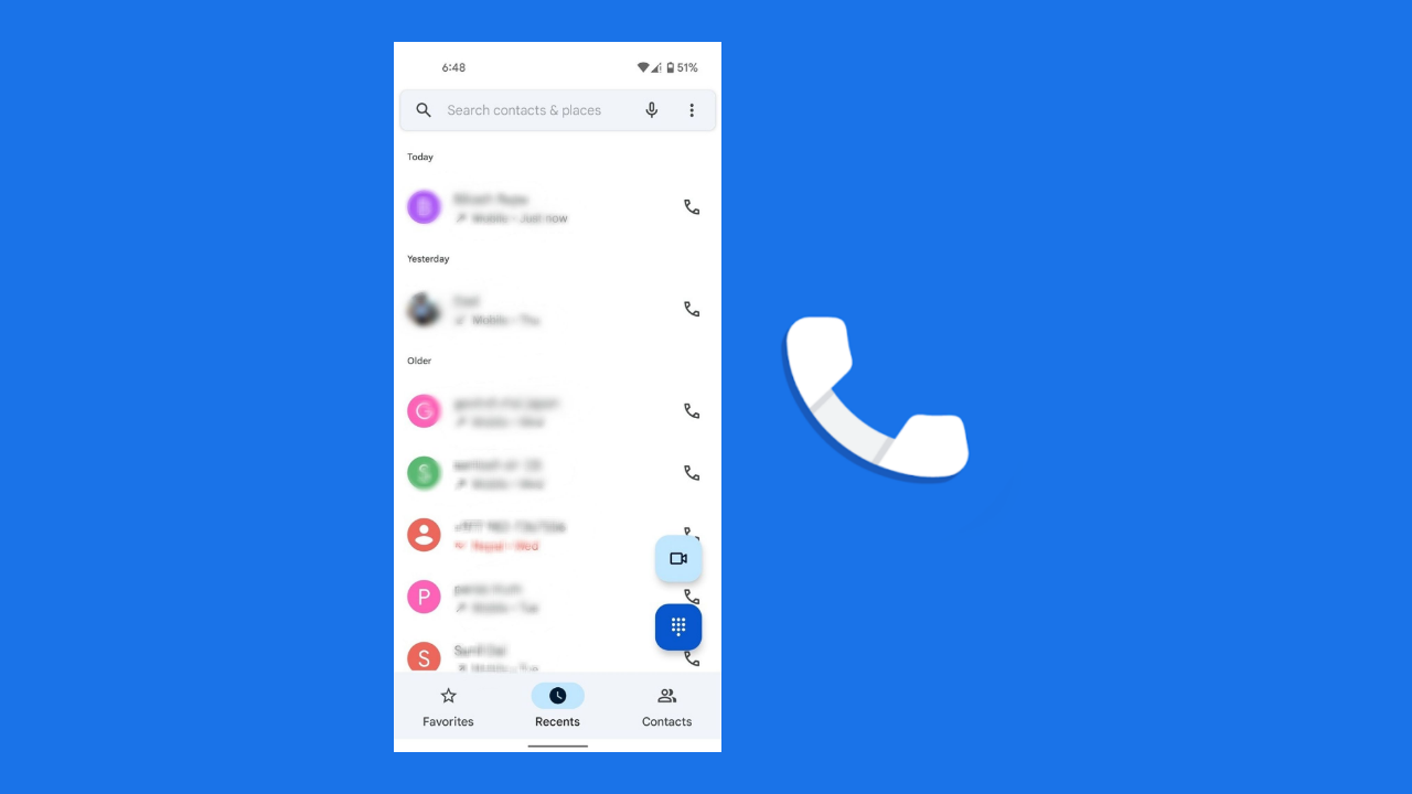
Cr: XDA Developers | Material You design on Google Phone App

Well, now version 70 of Google’s phone app includes a lot of new material. You design elements for users on Android 12. These include changes to the floating action buttons in the bottom tab. This update also brings in dynamic theming for Material You.

We should also just let you know that these design changes are not available for all of the users on Android 12 at the moment, as many of these changes have not shown up on Pixel 3 XLs, and they are not available on many different Pixel 4a’s too

All of this just points to the fact that Google is still experimenting with implementing these new design element changes in the Google Phone app. We should just wait to see the final product when the stable release comes out for Android 12 later this year, as you know, it will be a lot more polished and better to use.