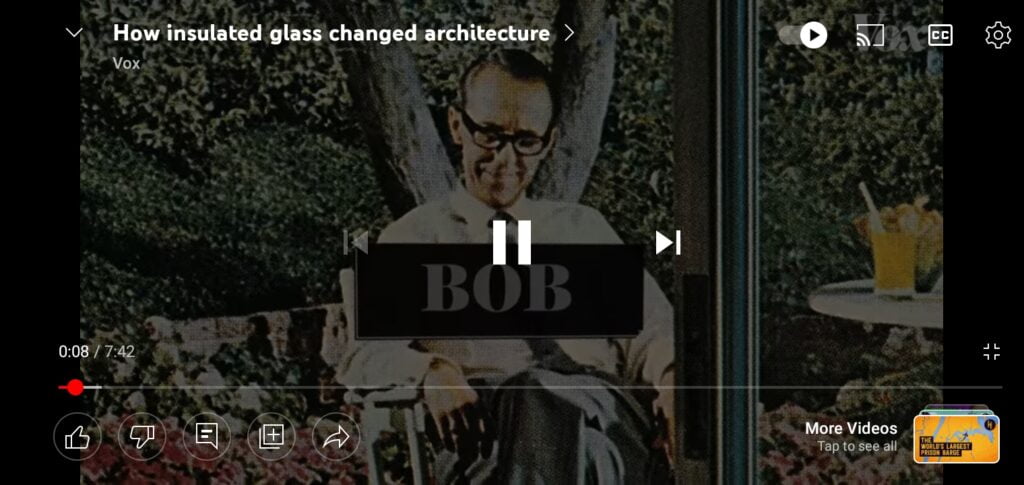
YouTube’s mobile app is rolling out a new design, making it seem easier to access controls when you’re watching videos on full screen. YouTube has rolled out a new design update for their mobile app, making it easier to access controls while watching videos on full screen. This new interface now adds many buttons on the bottom left corner, revealed when you pause the video at any point in time.


This is very different from what it was before and I did have a little bit of trouble navigating through the video but it’s totally fine now after using it for like an hour.
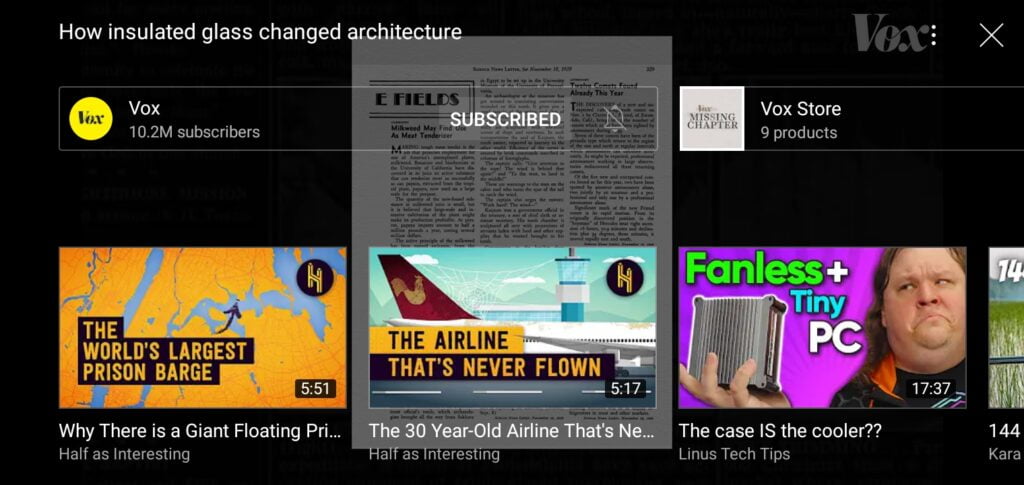
In the old interface there was a like button, dislike button, share and save buttons But you could only access them when you did swipe up from the bottom of the screen, revealing these icons and more videos that you could watch. But now with the new UI, when you just pause the video, you see the icons and when you swipe up the same way you did before, you will see the video recommendations without any buttons.

This new UI also lets users Watch and Read the description while also going through the comments and other information bits. This new video player UI has started rolling out on Android and iOS. It is not widely available to everyone as of yet though, But it probably will be making its way to everyone in the coming days or weeks.
youtube is also reportedly testing the ability to loop videos, this will allow users to view a single video on repeat without having to manually pull the slider or loop the whole thing, Particularly good for people who do still listen to music on the YouTube app but honestly, I don’t know what people still listen to music on the native YouTube app today though LOL.


